Visualize the Markets: Major North American Indices


This is unlikely to work well on mobile – sorry.
I helped you visualize the global stock market landscape in the last post. If you want some more technical details on how I built the below, you can go read about it there too.
In this post, we'll look at three major North American indexes: the S&P 500, the NASDAQ 100, and the TSX 60.
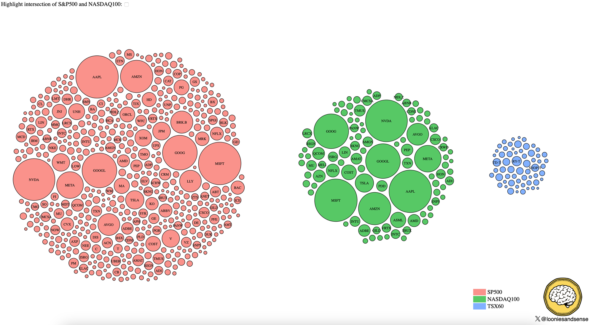
The following is not an Ishihara test gone wrong (and apologies to anyone who's colour-blind). It's a representation of these indexes using market cap-sized bubbles and circle-packing.
Don't get too lost in the exact numbers here. This is a snapshot of the market and won't be updated/isn't real-time.
Some things you can take away from this:
- The S&P 500 is the largest in terms of market cap at nearly twice the size of the NASDAQ 100.
- 85% of the NASDAQ 100 is in the S&P 500. When choosing the NASDAQ 100 or S&P 500 index, you're just choosing your brand of concentration risk.
- You can fit the entire TSX 60 into a big name like AAPL, MSFT, GOOGL or NVDA. Does this make the TSX bad? No, not necessarily. Market caps don't necessarily translate to investment return performance – price deltas do.
- The NASDAQ 100 is very tilted to a handful of names compared to the other two indexes.
I encourage you to click on the image to play with the interactive version. You can check the checkbox to see the intersection of the NASDAQ100/S&p 500. Mousing over each circle will reveal the underlying company details.
Remember, none of these give you true diversification. They all have currency and market biases. A global portfolio will generally set you up better for all market conditions.
Whilst every effort is made to make sure this information is complete and accurate, it is not advice and you should talk to a professional about your circumstances.